colour management, why do I need it?
why is colour management important?
Anyone who has ever scanned an image or taken a digital photo, or even just viewed an image on a computer screen and then seen it printed can easily appreciate why we need colour management in digital imaging. They don't just automatically "match" and colour management is what solves the riddle of "why not?"
Input, display and output devices do not interpret digital colour the same way. Furthermore, whilst monitors, cameras and scanners use RGB colour; for the most part printers use CMYK inks or a variation on those to produce colour.
 The range (the gamut) of colours that can be created using red green and blue light is different from the range of colours which can be created by ink on paper. So, when images from the screen are reproduced on a printer or printing press, the colours are very unlikely to match without some intervention. Here, colour management provides a practically vital level of assistance.
"Perfectly ‘tuned’ colour management reduces ink consumption, improves quality and raises productivity thanks to increased speed and the capability to minimise remakes, as accurate colour reproduction reduces chances for errors."
Dorin Pitigoi, colour management and industrial wide format printing, Graphics Display World
The introduction of Apple's Colorsync 2.0 technology in the mid 90's was a big milestone in colour management on the desktop. This system level software enabled the use of device profiles, device profiles are used to characterize the various equipment we use by measuring the way those individual devices reproduce special test charts during the process of scanning, capture, printing or viewing. Microsoft introduced their own similar system level colour in Windows 2000.
the international color consortium
Originally the Apple Color Consortium it became the International Color Consortium in 1993, the ICC was created in order to provide an open, vendor-neutral colour management system which would function transparently across all operating systems and software packages.
When devices are accurately characterized by building good ICC profiles, system level software can help graphics applications compensate for the changes made when colour is handled by those devices. The ICC profiles describe colour spaces, colour spaces describe device capabilities.
Before the introduction of Colorsync, non standardised device descriptions had been used in some proprietary systems [e.g. Quark X, eficolor]. This situation was improved immeasuably when in 1993 it became possible to make device profiles to ICC [International Colour Consortium] specifications and, thus, utilize them across an ever expanding range of imaging applications throughout the workflow.
Adobe's Photoshop 5 brought another significant enhancement to mainstream of digital imaging, introducing the concept of the "Device Independent" image storage colour space - which we now call a "Working Space", this further expanded the capabilities of colour management.
device independent working spaces
Device Independent Working Spaces contain image data in a linear and universally recognized form, so that image files can be not only edited in a predictable way but also can be passed between devices and between users where computers and software recognise embedded ICC profiles. An embedded ICC profile tag provides sufficient information about each file’s provenance to allow proper display and processing of the associated image.
Plainly, proper monitor display set-up and control is essential (this is normally referred to as "display calibration and profiling"), because we need to be sure that what we see on a screen will be very similar - if not identical - to the same image seen by another compliant user. Be she originator, manipulator, colour corrector or the printer who will make the printing plates.
cross device colour matching
 Cross device colour matching and the ability to produce pleasing results is enhanced by the ability so choose between different Rendering Intents. Those are used during the conversion between colour spaces, (sometimes called a "profile to profile conversion") - e.g. from Input Device (camera?) Profile to Working Space, Working Space to Display Screen or Working Space to Printer Profile.
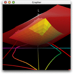
At left is an animated 3D gamut map of two example colour spaces. This colorthink software animation shows a (translucent red) RGB workingspace as much larger than the (almost) enclosed CMYK (inkjet) print colourspace (the solid coloured shape). RGB original image data (actually part of my test image) is also shown as a cloud of dots, many of which are plainly well outside of the CMYK device capability and, thus, need to be carefully dealt with (scaled) during calculation of the Workign Space profile to Printer profile conversion. Rendering intents are very important here because they set the behaviour for those "out of gamut" colours.
Rendering Intent choice should not be made by rule of thumb or even by blanket recommendation, it is actually far better if rendering intent selection is considered to be an image dependent and creative choice. This is because the way in which the colours are translated in the calculations from one colour space to the other is controlled by Rendering Intent choice and can significantly affect final reproduction.
With good colour management protocols and accurate ICC profiles, colour matching becomes a sophisticated and almost universally available procedure, this allows expectations to be managed - with good continuity of appearance between input, display and output.
Would you like to talk for free about how colour management might benefit your own working process? please click here.


